Miller Homes has partnered with abstract artist and colour specialist, Furrah Syed, to provide advice for homeowners looking to create their own emotional paradise in their spare room:
1 – If you want a room to relax in:
In the last three months there has been an increase in Google searches of:
– 49% for ‘meditation room’.
– 23% for ‘massage room’.
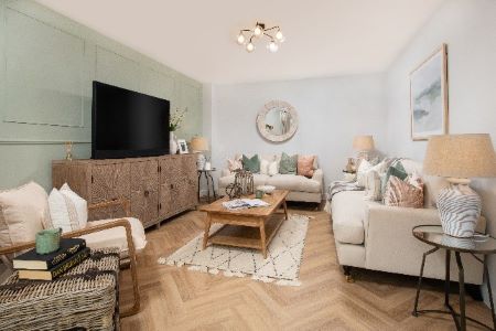
You should surround yourself with calming colours to create your own small place of tranquility in your home to allow you to de-stress, meditate or switch off. Go for shades such as china blue or mint green, as they give off a calming energy.
Avoid bright, bold colours such as reds and oranges when furnishing your room, as they will excite your senses. Instead, use shades of cream and beige to create a calming contrast.
2 – If you want a room to get creative in:
In the last three months there has been an increase in Google searches of:
– 91% for ‘guitar room’.
– 50% for ‘art studio at home’.
Whether you’re creating music, poetry or art, if you want your surroundings to help you feel more inspired, you should go for a couple of bright, bold shades – orange, yellow, purple or red. These colours are known to spark imagination and can evoke feelings of optimism and energy.
However, don’t use all four colours at once, as Furrah warns this can be overwhelming. A carefully curated mix of two of these colours will entice your creative energies and allow your inner visionary to come alive. These shades have a high frequency of energy vibrations, meaning that your mood will become uplifted and help you to spark ideas.
3 – If you want a room to let off steam in:
In the last year there has been an increase in Google searches of:
– 311% for ‘rage room’.
While the immediate satisfaction can be temporary, a dedicated ‘rage room’ space can help to calm you, alleviate nerves and see things more clearly. Go for shades of red when decorating it, as this colour has the highest frequency of energy vibrations, and you can physically feel the heat that red exudes. It thrills us as well, which is why most theatres have red interiors to get their audiences excited. Red will help to keep your energy on a high for longer.
4 – If you want a room to feel zen in:
In the last year there has been an increase in Google searches of:
– 50% for “crystal room”.
For some, crystals can be a helpful tool for stress relief and for connecting with ourselves when feeling overwhelmed. Go for earthy shades to create your own peaceful oasis. Furrah explains that shades like beige, oak, charcoal and burnt orange can imitate nature at its calmest state.
To accompany these tones, go for hints of dusty rose, olive greens and sea blue in some of your upholstery and cushions to add a touch of tranquility and serenity.
5 – If you want a room to workout in:
In the last three months there’s been an increase in Google searches of:
– 50% for “home gym”.
– 49% for “home gym equipment”.
A well-designed gym makes the prospect of a workout even more appealing. Colours and decor are fundamental for this, says Furrah. She suggests choosing either red or orange – but not both, as these shades can raise our blood pressure and stimulate stamina. Blend this with small drops of ocean blue, soft green and whites to increase your focus.
Elements of yellow can really help, too, as it has the ability to increase focus and motivate anyone who is working out in this environment. However, you should avoid pink in your gym as it can drain our energy. In fact, some sports teams even go to the extreme of painting the opposing team’s lockers pink to reduce their aggression.
6 – If you want a room to study in:
In the last three months there’s been an increase in Google searches of:
– 53% for “home library”.
– 86% for “home library design”.
You should decorate your home library with shades of red, as it’s the quickest colour read by our brain, helping to stimulate our energy and focus. Shades such as pistachio green can complement the red, improving our vision, focus and providing a sense of balance. However, be wary of colour overload – too many shades can be distracting. Where necessary, add furniture with calming colours such as cream and beige. And avoid pointed edges on furniture – softer edges have been found to keep us focused and reduce stress.
Anne Marie Britton, Group Sales and Marketing Director at Miller Homes, said:
“As our spare rooms extend beyond simply having guests stay over, more and more people are looking for creative ways to use this extra space. We live in a busy world, and we all need our own safe place to go when we feel overwhelmed, need to focus or perhaps just decompress. By using Furrah’s suggested colour palettes, you can tailor a space to meet your emotional needs without having the hassle of leaving your home.”
Read more of the latest developments in our new edition: April 2022 Single Issue – Show Home Magazine (yourshow-home.com)
Media contact
Roshini Bains,
Editor, Showhome Magazine
Tel: +44 (0) 1622 823 922
Email: editor@yourshow-home.com